I believe in living, and therefore also working, with intention. It took a couple of months for me to figure out what I wanted my logo to be, as I believe it subconsciously ‘sets the tone’ for the therapeutic work I’ll be doing.
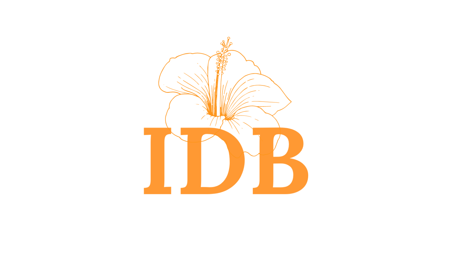
Why the Hibiscus Flower?
This is a personal meaning for me. A while back I lost my godmother to cancer. The night before she passed away, she managed to read a letter I wrote to her. Which said,
Just like a flower, don’t worry about how you’ll bloom. Turn towards the light, the love and the truth and you’ll flourish.
The next morning, she passed away. When I heard the news, I was by my window. In shock, I looked down at a plant I had been growing. It had just blossomed… into the most beautiful hibiscus I had ever seen.
For a hibiscus to represent my therapeutic work is to set my professional intentions. That is, to accompany clients on their journey towards the light, love and truth in their lives (whatever that may look like to them).
Why Orange?
The colour orange is associated with the sacral chakra. According to ancient Vedic beliefs, chakras are energy centres around the human body, of which there are seven. Each chakra contributes to the individual’s wellbeing in unique ways.
The sacral chakra is related to our emotions. Its element is water, so it is characterised by flexibility, freedom and flow. It is also heavily connected with our relationships.
When the sacral chakra is balanced, we feel empowered, connected with ourselves and others, self-confident, creative and content.
By choosing the colour orange, I hope that its symbolism sets the tone for all my therapeutic services – to help individuals be self-confident, balanced in their emotional processing and genuinely feeling joy in their lives.
Does this hibiscus flower and orange mean anything to you? Let me know, I’m curious to hear.
